Responsive bar charts in HTML and CSS
Building flexible data visualizations for international sites
For our international clients, we have created dynamic charts and data visualizations for the web. Charts typically render shapes like lines and paths, rectangles and circles. They contain text for titles, axis labels, numerical values and legends.
SVG is the good fit for this purpose. It embeds directly into HTML and pairs well with CSS. However, for dynamic data visualizations on the web, SVG poses a challenge.
Responsive charts and the problems of SVG
The websites we build feature responsive layouts and fluid typography. We employ CSS Flexbox and Grid together with media and container queries to fit in the content. There is not one single fixed presentation, but many possible presentations depending on the content and the reading environment.
In contrast, SVG does not have layout techniques like Flexbox, Grid or even Normal Flow. In SVG, all shapes are absolutely positioned. Text does not wrap automatically. The shapes and text need to be laid out manually by the code that generates the SVG.
SVG does scale continuously, as the name says – but for charts on the web, we usually do not want that. A small chart should not look like a downscaled big chart. Text would become unreadable, shapes would become tiny pixel mush – even with techniques that prevent the scaling of some graphical features.
For charts on the web, we want quantitative and qualitative responsive scaling. A small and a large chart should be designed and laid out differently. A small chart should focus on clear, distinguishable marks that represent the data. A large chart should take advantage of the screen estate to show more items and details as well as provide context.
For example, a line chart with multiple lines may switch to small multiples on smaller viewports or containers.
We have typically implemented this responsiveness with client-side JavaScript logic. JavaScript is able to read the container size and measure text in order to compute all shape coordinates and sizes. This often involves decollision with force simulations.
This approach has severe disadvantages. The cycle of forcing the browser to compute the style, reading sizes and setting positions leads to layout thrashing and slows down the chart rendering.
When the container size changes, for example due to a browser resize or orientation change, the JavaScript needs to compute all SVG positions and sizes from scratch. Assuming this takes 50-100ms per chart, a page with 20 charts freezes the browser for 1-2 seconds.
HTML, CSS and SVG hybrid
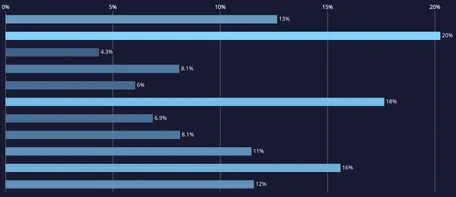
Horizontal bar charts are simple yet effective, intuitive and accessible visualizations. They are versatile regarding the bar design, labeling, value placement and axes. And they can be highly flexible regarding the container size.
We have a pretty solid implementation of a responsive bar chart. In narrow containers, the row label is shown on top of the bar. In wide containers, it is shown next to the bar.

This chart is a hybrid of HTML, CSS and SVG. We wanted to use essential CSS layout methods like Flexbox instead of re-implementing layout algorithms in JavaScript. However, the synchronization with the SVG parts is still slow, complex client-side JavaScript code.
Bar chart in plain HTML & CSS
We were wondering: Can we achieve this with HTML and CSS alone, preferably without SVG and with less JavaScript logic? We fiddled around, but never finished this idea.
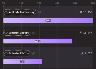
Then we saw the beautiful responsive bar charts of State of JS, made with HTML & CSS only. On narrow viewports, they use a two-column grid:
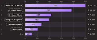
On wide viewports, this is a three-column grid with subgrids that inherit the column setup:
These well-made charts encouraged us to try to migrate our bar charts to HTML & CSS.
Grid setup
For a start, we rebuild the basic structure:
See the Pen Responsive bar chart with ticks by molily (@molily) on CodePen.
In the narrow version, the each row (li element) is a two-column grid:
cssdisplay: grid;
grid-template-columns: minmax(0, 1fr) min-content;
grid-template-areas:
  "dimension value"
  "bar bar";
position: relative;
In the wide version, the wrapper (ol element) is a three-column grid:
csscssdisplay: grid;
grid-template-areas: "dimension bar value";
grid-template-columns: fit-content(10rem) 1fr min-content;
The row (li) is a subgrid that spans all columns:
csscssdisplay: grid;
grid-template-columns: subgrid;
grid-template-areas: none;
grid-column: 1 / -1;
Real-world requirements
Our real bar chart, however, is much more complex and has the following requirements:
Internationalization with bidirectional text: We're building charts for sites in six languages and two text directions: Left-to-right (LTR, like English and Russian) and right-to-left (RTL, like Arabic and Hebrew).
Positive and negative values. Bars grow to both sides.
Row labels may have an arbitrary length and should wrap and align nicely.
Value labels should be positioned at the end of the bars, not inside them or in a separate column.
Do not repeat the axis tick lines for each row if it's avoidable.
This is the solution we came up with:
Responsive bar chart in HTML & CSS
This is version 2 which implements essential feedback from Vesa Piitinen.
See the Pen Bar chart V2 by molily (@molily) on CodePen.
Let's dive into the implementation.
Responsive grid setup
The HTML structure looks like this:
html<div class="bar-chart">
  <div class="ticks" aria-hidden="true">
    <div class="tick" style="inset-inline-start: {percent}%">{tick value}</div>
    <!-- … more ticks … -->
  </div>
  <ol>
    <li>
      <div class="dimension">
        <span class="dimension-label">{dimension label}</span>
      </div>
      <div class="bar" style="margin-inline-start: {bar start}%; width: {bar width}%">
        <span class="bar-label">{ bar label }</span>
      </div>
      <div class="value" aria-hidden="true">{ bar label again }</div>
    </li>
    <!-- Bars with negative values require a class is-negative: -->
    <li class="is-negative">
      <div class="dimension">
        <span class="dimension-label">{dimension label}</span>
      </div>
      <!-- And the value need to placed before the bar: -->
      <div class="value" aria-hidden="true">{bar label again}</div>
      <div class="bar" style="margin-inline-start: {bar start}%; width: {bar width}%">
        <span class="bar-label">{bar label}</span>
      </div>
    </li>
    <!-- … more li elements … -->
  </ol>
</div>
In the narrow version, the .bar-chart wrapper is a three-column grid:
cssdisplay: grid;
grid-template-columns: min-content 1fr min-content;
grid-template-areas:
  "dimension dimension dimension"
  "valuePaddingStart bar valuePaddingEnd";
The ol element and li elements are subgrids:
cssdisplay: grid;
grid-column: 1 / -1;
grid-template-columns: subgrid;
In the wide version, the wrapper becomes a four-column grid:
cssgrid-template-areas: "dimension valuePaddingStart bar valuePaddingEnd";
grid-template-columns: fit-content(10rem) min-content 1fr min-content;
Each row remains a subgrid.
Bidirectional text
Internationalization is where HTML and CSS shine compared to SVG.
Our JavaScript code that generates SVG charts is full of if (isLTR) {…} else {…} conditionals. In SVG, the origin of the coordinate system is always top left. X coordinates need to be calculated using those LTR/RTL switches.
In HTML and CSS, we can simply use logical properties like inset-inline-start/-end, margin-inline-start/-end as well as padding-inline-start/-end to solve most left-to-right vs. right-to-left differences. When laying out the boxes in CSS, we can work with the text direction.
For example, each bar is a Flexbox container with the value label nested inside. Then the label is positioned next to the bar: For positive values, we add a box with ::before plus content: '' with a padding-inline-start of 100%. For negative values, we add a box with ::after plus content: '' with a padding-inline-end: 100%. These boxes push the label out of the bar so it sits right next to it.
We still need to handle positive and negative values differently, but by using Flexbox, logical properties and the current text direction, we don't need to handle left-to-right and right-to-left differently.
The bar labels are also rendered into the columns named valuePaddingStart and valuePaddingEnd. These invisible placeholders ensure the columns have the correct width to accommodate the value labels. So the labels appear twice in the DOM. The placeholders have aria-hidden="true" and visibility: hidden though.
Tick lines spanning the full height
Our goal to put the axis tick lines in the DOM only once instead of repeating them for each row complicates the grid. The challenge is to constrain the tick lines in the bar column horizontally, but let them span the whole grid vertically.
This is possible with grid-row: 1 / -1 given the grid has explicit rows. It does not work with an arbitrary number of implicitly-created rows.
So we defined an outer grid that has two fixed rows. The ticks are then positioned in the first row, spanning two rows.
css.ticks {
  grid-column: bar;
  grid-row: 1 / span 2;
}
The list of bars is then positioned in the second row and spans all columns of the parent grid. It creates a subgrid that inherits the grid configuration from the parent grid.
cssol {
  display: grid;
  grid-row: 2;
  grid-column: 1 / -1;
  grid-template-columns: subgrid;
}
The subgrid may then create an arbitrary number of implicit rows. It remains nested in the second row of the outer grid.
See the Pen Grid: Span whole grid by molily (@molily) on CodePen.
Accessibility considerations
Accessibility of data visualizations is a top priority for us and our clients. In our SVG charts and HTML / SVG hybrids, we have assigned ARIA roles and accessible labels so graphical shapes have proper semantics and textual representation. In the accessibility tree, these charts appear either as lists (like ul or ol elements) or tables (like the table element) so users can read and navigate the chart in a familiar way.
While we have made SVG charts accessible, it is simpler and more robust to use semantic HTML directly. The shown HTML and CSS bar chart uses plain ol and li elements with built-in ARIA roles. Screen readers and other assistive tools read out the labels and values.
Edge with JAWS on Windows:
Chrome with VoiceOver on MacOS:
Recap
Today's websites feature responsive layout and fluid typography. Data visualizations should adapt these design techniques.
While responsive and accessible SVGs are possible, they require manual client-side JavaScript logic. HTML and CSS allow us to create charts using declarative layouts and bidirectional positioning without computing positions and preventing overlap manually.
We've demonstrated this for a bar chart. We've also created HTML, CSS and SVG hybrids where each technology does what it is good at.
Building your next data visualizations
At 9elements, we have been visualizing data for our clients for more than 10 years. In 2013, we developed GED VIZ for the Bertelsmann Foundation, visualizing global economic relations. From 2014 on, we developed the front-end and the chart rendering of the OECD Data Portal. In 2015, we contributed to the World Economic Forum Inclusive Growth Report. The bar charts described in this article are part of a long-term work for an international organization in the public health sector.
Let us discuss how we can help you to explore, present and visualize the data of your organization or business! Contact us.
Acknowledgements
Thanks to my colleagues Nils Binder, Julian Laubstein and Matthias von Schmettow for this collaboration.
Thanks to Vesa Piittinen for substantial feedback and many valuable ideas on how to improve and simplify the HTML and CSS. Please have a look at Vesa's version of the bar chart which demonstrates more clever optimizations.
Thanks to the data visualization designers Alice Thudt, Christian Laesser and Moritz Stefaner for their stellar work on the Data Design Language. Thanks to Sarah Fossheim for their accessibility reviews and insights.
Thanks to the Devographics team behind the “State of HTML/CSS/JS“ surveys for the inspiration.
Thanks to our client for the opportunity to work on ambitious data visualizations.

